
Friday 13 December 2013
DOUBLE PAGE SPREAD - PagePlus
Front Cover and Contents - Page Plus

This is my first constructed magazine cover and contents page with appropriate images and added text. Assets on the program 'PagePlus' were added when needed.
Friday 6 December 2013
Drafting and Planning - Double Page Spread - Kat Von D

This is my first draft that I have constructed to show how my double-page spread will look in my magazine.
I have been thinking about two ideas, the line in yellow, is the article put on the left and right page, whereas the blue line outlines the continuation of the same article over both pages.
The text will flow around the image of 'Monika' to give an organic feeling of the text, and shows a good relationship of 'Monika' and the text.
Monday 2 December 2013


Friday 22 November 2013
Drafting & Planning - Billboard Magazine
 |
| I chose this magazine cover as it contains a good layout. There is not much negative space. I want my magazine to take a similar approach to this cover, as it includes all additional cover lines on the left and right of the main cover image. And the cover image itself ncludes someone big in the vocal pop music industry and as it's a well-known magazine, it can afford to use some conventions differently e.g the main cover line is ABOVE the masthead. I will use the same type of layout for my magazine and the colour scheme too. The layout of this magazine is one of the best msic covers I've seen as the ethos of the magazine and style of the cover artist is used in symbiosis. |
Friday 8 November 2013
Research Into Similar Products - We Love Pop Magazine Analysis of Design
Although my main aim for my magazine was to stray away from typical mainstream pop magazines, but I thought that the magazine 'We <3 Pop' is an amazing magazine, not for the content specifically, but the front cover is laid out in a way that I find inspiring.

I love how the masthead is slanted as it creates a modern twist. I don't particularly PERSONALLY like the colour scheme as I find it too carnivalesque and too busy to use ideas from but the layout is my favourite thing. The way that the column in the left-third appeals to the audience as it shows what is also included in the issue.
The cover image is my favourite as the background is plain but it uses blocking to show two members of different groups, and the cover line shows who's who.
The cover lines at the bottom include PUGS and PUFFS as they are included in the bottom right.
The barcode is hidden quite well next to the black and white dress and under the vivid pink text.
This magazine cover isn't the best 'We <3 Pop' cover but it's one I used as an example to show how I could incorporate some ideas into my tasks' design.
Wednesday 6 November 2013
Nancy Q Magazine - CONVENTIONS ANALYSIS

Sorry it is hard to read, I edited it on Microsoft Word and uploaded it through Publisher.
(Full text will be e-mailed and uploaded later)
Monday 4 November 2013

Friday 18 October 2013

Friday 11 October 2013

Drafting/Planning - Photo Cropping & Sizing

Tuesday 8 October 2013


Friday 4 October 2013
Typography Exercise

A: The font of the cover-line is much too plain to be able to show a symbiotic relationship. Although the colours match the cover image, and the font is easy to read, it doesn't show any link between the type of image, the style of artist or the genre of magazine. So, this font wouldn't be suitable on a 'Christina Aguilera Special' cover of a music magazine. Ranked 4th.
B: I ranked this cover font 3rd as the font is dramatic and shows a good relationship between the genre of the magazine and the style of artist. This font is in capital letters which links the 'power' of typography, to the 'power' of the artist, summed up with the 'power' of the magazine.
C: Comic Sans is commonly used to show a childlike relationship to a text, and this typography is very unsuitable in this form of media. Music magazine covers rely on a powerful, strong message between the reader, the magazine AND the cover image. This font will be unsuccessful in portraying the style of magazine as VIBES (in the masthead) is in tall, capital font and Comic Sans is a font that will be unable to successfully show the symbiotic relationship; and this is why i ranked it in LAST PLACE.
ugh there are a number of things wrong with this font, it's still far better than C. This font is old-fashioned and portrays the complete opposite message to the futuristic/modern mood of the image. The style of Christina Aguilera is powerful, chic and modern, and this 'swirly' 'fancy' old script typography is wrong for this kind of magazine. Ranked 5th.
E: Now, this font is in capital letters that matches that of the masthead. This font is in capitals with a slightly cracked appearance. The bold appearance matches the bold image and bold masthead quite well, and symbolizes the contemporary feel of the magazine. This music magazine cover line suits the magazine cover well but the style of font is too "rock" for a pop-vibe magazine which is why this font is ranked 2nd.
F: MY NUMBER 1. This typography is perfect for this style of magazine. The symbiotic relationship is demonstrated well as the cover line appeals to the target audience. The target audience is modern, music-orientated people and suitably matches the "Bionic" futuristic mood of Christina Aguilera on the front cover. This typography is ideal for this cover as the font is powerful and strong and symbolizes the genre of magazine and the personal style of Christina Aguilera and her new album.
Friday 20 September 2013

Magazine Conventions - The Voice Coaches

The layout I thought was conventional due to the masthead and the cover lines, but also slightly unconventional as it uses blocking as there's more than one subject, all of equal importance to the issue.
Friday 13 September 2013
Emeli Sande - Music Artist Website / Questionnaires & Analysis
http://www.emelisande.com/
My Website
I chose the website for singer, Emeli Sandé because she's a relatively new talent, who delves into many different genres of music. I thought her official website would contain a lot of news, facts, and photos about her and the fact there are so many on there is what makes it a very informative, and entertaining website.
The home page consists of a large image of her, with her signature nose ring and her big blonde quiff. These contrast with the monochrome effect of the website to create a modern, yet feminine feel to the website.All the links to other pages, and information about her life and her career are laid out in a column design with a useful toolbar across the top to navigate the reader to other pages. Emeli Sandé is a very versatile artist, and her website illustrates the many different features of her personality and career. I enjoy her music because it can be quite up-tempo in her pop/ R&B songs, and much more deep and sombre in her ballads. She has an extraordinary talent and her website reflects this, and that is the reason I chose her website.
-------------------------------------------------------------------------------------------
Questionnaires
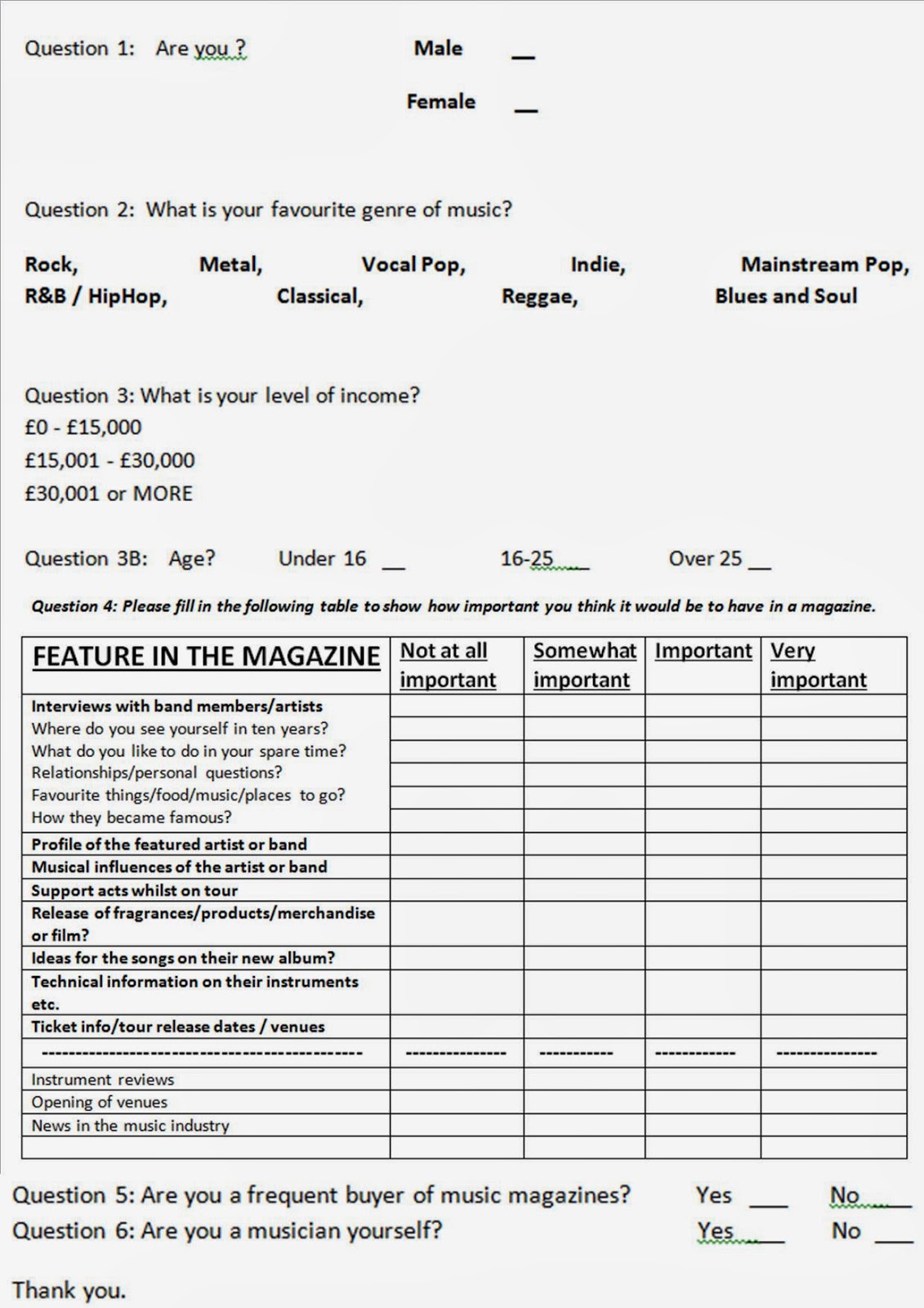
For my student magazine, I did a questionnaire to find out what the issue should contain.
The questions I used were.
1) How often do you read magazines?
Daily 1-4 Times A Week Monthly A few times a year Never
2) If you said 'Never' what is the reason for this?
= The magazines in shops don't interest me.
= The magazines on sale contain too much gossip and trash about celebrities.
= I never have time.
= They're too expensive.
= Other...
3) If St Thomas Aquinas Sixth Form had its own magazine, would you read it?
= Yes
= Maybe
= No
4) What faculties would you like to see appear most within an issue?
= Mathematics
= English
= Science
= Sports
= I.C.T
= Philosophy & R.E
= Modern Foreign Languages
= Humanities
= Vocational
= Technology
= Music & Drama
= Oaks Courses
5) Would you like to read information on NEW things happening in school?
= Certainly
= I suppose
= Not really
6) What colours would you expect to see in our school magazine?
--------------------------------
7) Do you think Mr Foley's idea of a competition in the Friday letter is a good idea?
= Yes= No8) Would you like ADVICE in a 6th form magazine?
= Yes
= No
Analysis of Music Magazine Cover - Amy Winehouse

The Headlines lower down 'Summer Tours' present a change in font and colour as they are noticeable on the left hand side of the page, and underneath a similar headline reading 'The Diva & Her Demons' demonstrates a clue into what the issue will involve.
The large blue caption, positioned at the bottom of the page, reading 'Amy Winehouse' can be seen more easily than the actual title at the top, as the main story of Rolling Stone, this issue, is Amy Winehouse the caption needs to be seen, to compliment the image and the reader will want to see more inside.
The actual image of Amy Winehouse completely dominates the whole of the front cover and the use of the colour black, shows a connotation of sombre and soulful. And this reveals a mood change to the issue as the alliteration of 'diva' and 'demons' in the second headline contrast the image, and the concerned yet vulnerable look on Amy's face is shadowed by the heavy black eyeliner and plain black vest.
I chose this image as the colour scheme is inviting and contrasts the use of black on the image well. Only a small amount of information about the features inside is revealed in the lower headline, but the large caption stands out and draws you in to reading more about this fabulous, yet troubled artist.
Subscribe to:
Posts (Atom)